Friday, September 16, 2016

On the GWARpath


I featured my new portrait of Oderus Urungus, former lead singer of the theatrical metal band GWAR, on my Facebook art page this week. In my description, I expounded on my first experience at a GWAR concert in the early 1990’s. I had the privilege of seeing them two more times after that; each concert leaving an equally lasting impression. Although I don’t lay claim to being a bohab, an honor bestowed upon only the most rabid of GWAR fans, I’m definitely a fan and have been for quite some time. I had entertained the idea of painting the band back then but it never materialized.

During the creation of “13 Months of Horror” in 2015, a mutual fan of both GWAR and myself named Chris wrote to me and asked if I would consider designing Oderus Urungus, former lead singer of GWAR. I told him that it was an excellent idea but it would have to remain on my plate for a while as I still had a large task ahead of me. In December 2015, I designed several OSI 74 hosts including GWAR manager Sleazy P. Martini, host of Sleazy Pictures after Dark, a must-see excursion into the realm of classic, sleazy exploitation flicks; I’m a huge fan of his show but I digress. Chris dug my portrait of Sleazy and I assured him there would be more to come.


A while back, I was talking to my good friend Jerry Moore AKA Karlos Borloff and he mentioned how he would like to see me design GWAR. I told him that it was something I had considered but would like the band to get involved. Jerry told me he would see what he could do and presented the idea to Don Drakulich AKA Sleazy P. Martini. A couple of days later, I got a call from Don and we discussed the possibility of a GWAR character gallery. He suggested that I design one member, send it to him, and he would present it to the band. This seemed the perfect time to pay tribute to Oderus.


I emailed Don my finished portrait and awaited his answer. He got back to me last Saturday and said that the band loved the piece but they didn’t have a project to work with me on at this time; however, he said that the band would be willing to extend licensing rights to me. Needless to say, I’m ecstatic and eager to begin my GWAR gallery. It has always been a dream of mine to be a rock artist and design my favorite musicians, so now thanks to the suggestion of one loyal GWAR fan and the help of my friend Jerry Moore, my dream is coming true.

Now I’m on the GWARpath so get ready, more badass GWARtwork is coming your way soon… maybe I can consider myself to be a bohab after all.


Friday, September 9, 2016

Anatomy of an Angel

I just presented my new Doctor Who design on social media last night, one of my favorite of the new era of villains... a Weeping Angel. Today I will discuss the design process and show the original final pencil design. Below is the finished piece.

 
When I first considered the design, my initial concerns were dimension and color. Dynamically, I decided that I wanted an action pose, one that felt as if the angel was actually coming out of the portrait. To achieve depth, I felt it was necessary to construct the piece in layers by creating the wing and hand as individual forms separate from the main portrait. On the TV show, the angels are statues of only one color so in order to make the piece POP, I had to manipulate the color to give it the dimension that I wanted. I decided to use subtle color manipulations to push the tongue and wing into the depths of the piece as well as punch the hand into the foreground. I specifically used the position of the hand to frame the face in order to draw the viewer's eye into the angel's gaze. I used a muted purple on the shadowed side of the face to both connect the image to the background and further push the hand into the viewer's perspective. When I was finished with the initial color choices, I felt that the face was still missing an integral dynamic so I decided to lighten the left eye with the same color as the hand to give it the final touch it needed.
 
 
This is my final pencil design. I've been asked if I do all my design work in the computer and the answer is absolutely not; I'm still somewhat old school when it comes to my art. I design everything by hand with mechanical pencil on paper; I've never gotten used to doing my design work in the computer. I do like to have an original sketch when I'm finished as well. After completion of my pencils, I scan my design into the computer, open an Adobe Illustrator file, and then finish it using the pen tool. For any of you aspiring artists out there, mastering the pen tool is essential to creating modern, dynamic design.
 
The Weeping Angel is one of my personal favorite designs. I hope you enjoy it as well and learned something from my anatomy lesson. Thanks for following my blog!!
 

Tuesday, September 6, 2016

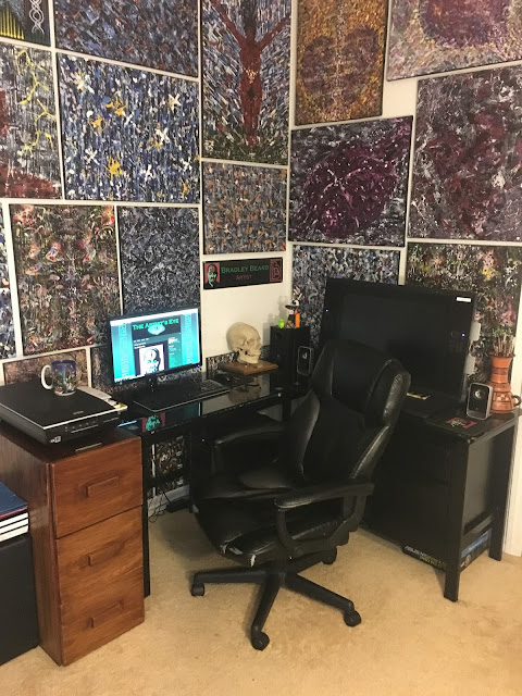
A Room With Infinite Views


An artist's studio is possibly the single most important aspect of creation for every artist. It's basically where we spend the majority of our time creating visual eye candy for our fans and followers... it's where the magic happens. Today I offer you a look inside my studio.

 
I've tried to create an environment that is conducive to my creative mood. A studio is a personal extension of every artist and should be both functional and comfortable. Personally, I feel the single most important aspect is organization. If a studio is cluttered and in a state of disarray, the artist can't truly focus (at least in my case) and becoming a successful working artist will be that much harder to achieve. My studio is set up to allow me to create both organic and computer art. Although I do all of my design work at the kitchen table, my studio is where I begin my preliminary designs and later finish them in Adobe Illustrator.


My studio is my sanctuary. It has everything it needs to keep me occupied and inspired with little or no distractions. With all of my favorite music loaded into iTunes... I just click play and let the art begin.


Thursday, August 25, 2016

Me, Myself, and Eye


Ummm... What's with the eye, you ask? Well, let me tell you about it. On September 29, 2014, I had already made the conscious decision to begin a month long artistic journey... WHICH ultimately turned into a 13 month path of insanity called the "13 Months of Horror". My job at the time was phone based which allowed me to be able to sketch while I was talking, a favorable position which allowed me to create a new piece of artwork daily. I decided that I needed a self portrait that would accurately reflect the art that I was about to release to my friends and family on Facebook. The funny thing about this is that there really was no conscious thought before hand as to what I wanted it to look like.

I first sketched out a detailed version of my face, then removed the detail and stylized the design. I wanted something that would be slightly creepy and reflect me as an artist. I had originally thought of presenting myself as Frankenstein or some other creature of the night but that idea didn't seem very original not to mention the fact that in my minimalistic style, my face might end up being unrecognizable. Then it hit me, I literally saw the finished design in my mind's eye and that's what the design became... a reflection of an artist who only sees through his mind's eye. I decided to re-create myself as a zombie because zombies are driven by their desire to consume just as I'm driven by my desire to create. I thought adding the metal circle and allowing a portion of my brain to be exposed as well would give it the "creep factor" that it needed and reveal my mind's eye.

After I got home from work, I scanned the design, took it into Adobe Illustrator, and completed it using the pen tool. The colors were initially unintentional, except for the green eyes. I had already decided to use bold, saturated colors in my earlier minimalistic pieces so I stayed with the same mindset. I was also planning on using the design for screen printed t-shirts so I also tried to keep my color choices to a minimum. Even though we refer to our brains as "gray matter", oddly enough our brains are quite pink so I chose a salmon color for the brain and decided to carry it across to the background, allowing the bright green of the primary eyes and the white of the third eye to control how a viewer might see the portrait. So that's it in a nutshell, it wasn't preconceived... I was just being guided by my artistic eye. Is this what I really look like, you ask? Yes, but only when I'm sleeping.